本篇文章介紹 R 軟體在大量資料的相關性資料視覺化應用, 大量數值資料結果有時不易看出資料的樣式 (Patterns), 此時可使用弦圖以建立視覺化結果.
弦圖 (Chord Diagram, Chordal Graph) 參考: https://en.wikipedia.org/wiki/Chordal_graph

說明:
1. Windows 系統中, 先安裝 Rtools 編譯工具, 此工具可以下載並安裝相關套件.
2. 安裝 devtools 套件, 使用 install.packages("devtools")
3. 安裝 chorddiag 套件進行弦圖資料視覺化, 此套件非 CRAN 標準套件, 可使用 devtools 套件中的 install_github 函數進行套件之安裝.
安裝指令 devtools::install_github("mattflor/chorddiag")
參考網站: https://github.com/mattflor/chorddiag
套件使用時, 輸入資料必須採用矩陣資料 (matrix), 且行與列的個數須相同.
繪製弦圖函數為 chorddiag.
R程式碼:
# title: chord diagram
# date: 2019.10.13
# 安裝 Windows 版本 Rtools
# http://cran.csie.ntu.edu.tw/bin/windows/Rtools/
# 安裝時, Add rtools to system PATH 記得打勾
# 安裝 devtools 套件
install.packages("devtools")
# 安裝 chorddiag 套件
devtools::install_github("mattflor/chorddiag")
# 載入套件
library(chorddiag)
# 建立資料
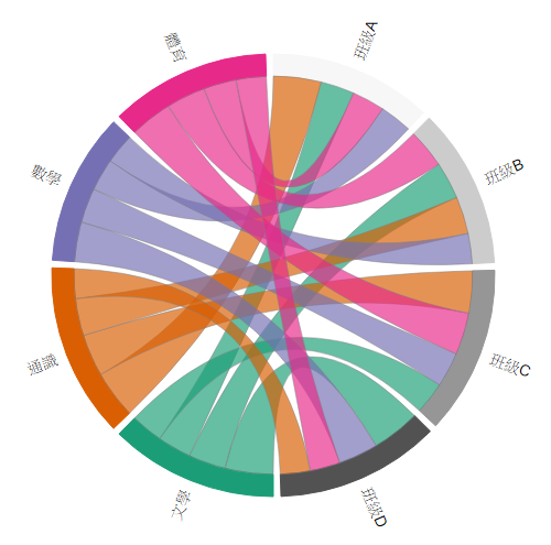
students <- as.matrix(data.frame(
文學 = c(68, 75, 65, 97),
通識 = c(96, 75, 85, 60),
數學 = c(65, 61, 70, 80),
體育 = c(66, 79, 85, 61)))
row.names(students) <- c("班級A", "班級B", "班級C", "班級D")
# 繪製弦圖
chorddiag(students)
# 視覺化進階優化1
chorddiag(students, type = "bipartite")
# 視覺化進階優化2
chorddiag(students, type = "bipartite", showTicks = FALSE)
# 視覺化進階優化3
chorddiag(students, type = "bipartite", showTicks = FALSE, groupnameFontsize = 14, groupnamePadding = 10, margin = 90)
# end
弦圖 (Chord Diagram, Chordal Graph) 參考: https://en.wikipedia.org/wiki/Chordal_graph
說明:
1. Windows 系統中, 先安裝 Rtools 編譯工具, 此工具可以下載並安裝相關套件.
- 連結至 Rtools 網站, 例如: http://cran.csie.ntu.edu.tw/bin/windows/Rtools/
- 下載最新版本 Rtools35.exe (約104MB)
- 安裝 Rtools 軟體, 全部採用預設值安裝,
例: 安裝目錄為 C:\Rtools
例: □Add rtools to system PATH 選項記得打勾
2. 安裝 devtools 套件, 使用 install.packages("devtools")
3. 安裝 chorddiag 套件進行弦圖資料視覺化, 此套件非 CRAN 標準套件, 可使用 devtools 套件中的 install_github 函數進行套件之安裝.
安裝指令 devtools::install_github("mattflor/chorddiag")
參考網站: https://github.com/mattflor/chorddiag
套件使用時, 輸入資料必須採用矩陣資料 (matrix), 且行與列的個數須相同.
繪製弦圖函數為 chorddiag.
R程式碼:
# title: chord diagram
# date: 2019.10.13
# 安裝 Windows 版本 Rtools
# http://cran.csie.ntu.edu.tw/bin/windows/Rtools/
# 安裝時, Add rtools to system PATH 記得打勾
# 安裝 devtools 套件
install.packages("devtools")
# 安裝 chorddiag 套件
devtools::install_github("mattflor/chorddiag")
# 載入套件
library(chorddiag)
# 建立資料
students <- as.matrix(data.frame(
文學 = c(68, 75, 65, 97),
通識 = c(96, 75, 85, 60),
數學 = c(65, 61, 70, 80),
體育 = c(66, 79, 85, 61)))
row.names(students) <- c("班級A", "班級B", "班級C", "班級D")
# 繪製弦圖
chorddiag(students)
# 視覺化進階優化1
chorddiag(students, type = "bipartite")
# 視覺化進階優化2
chorddiag(students, type = "bipartite", showTicks = FALSE)
# 視覺化進階優化3
chorddiag(students, type = "bipartite", showTicks = FALSE, groupnameFontsize = 14, groupnamePadding = 10, margin = 90)
# end